
Role
Team
3 Designers
2 Engineers
Timeline
Skills
User Research
Information Architecture
Visual Design
Design Systems
Context
Initiated in 2020, Fritz is an astronomical data platform utilized by undergraduates, graduates, doctoral researchers and professionals in astronomy. Fritz enables users to follow up on real-time observations, archive multi-survey data, and interact and collaborate.
In 2023, I had an amazing opportunity to develop a full redesign of the Fritz website to streamline the user experience and optimize the user interfaces.
Before & After
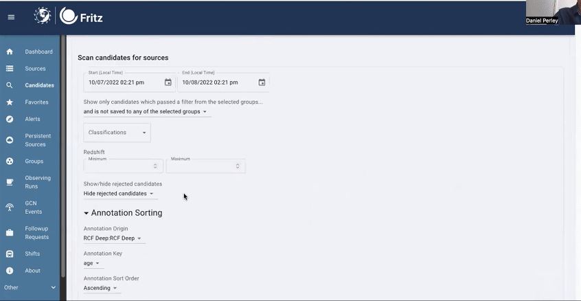
Old Candidates Page
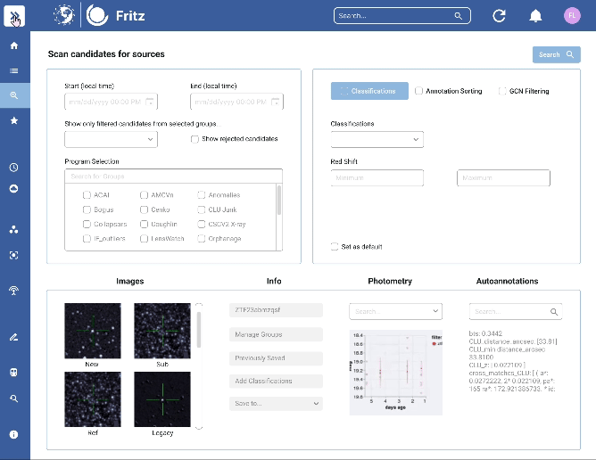
New Candidates Page
New Experience
01. Better grouping
Directs user attention to information relevant to their goals
02. Increased Efficiency
Facilitates easy and intuitive navigation
03. Clear contrasts
Enhances readability with color and type contrasts
Impact
We were able to deliver an optimized experience for users!
75%
Faster Candidate Screening
Users can find the best candidates more efficiently.
45%
Cleaner Interface:
A more streamlined and focused workspace with reduced white space.
User Survey
01. Identify High-Priority Features
To gain a deeper understanding of user needs, we conducted a user survey that gathered responses from 19 distinct users.
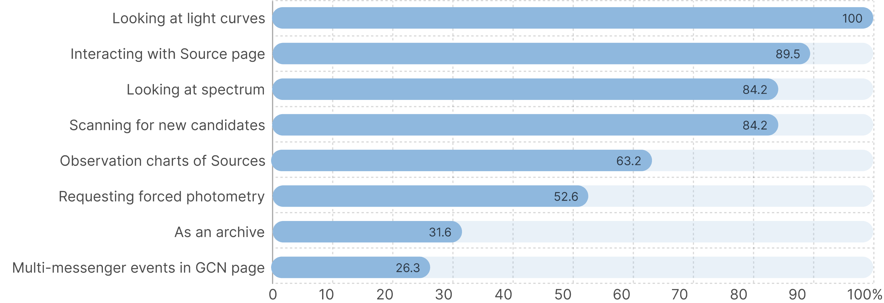
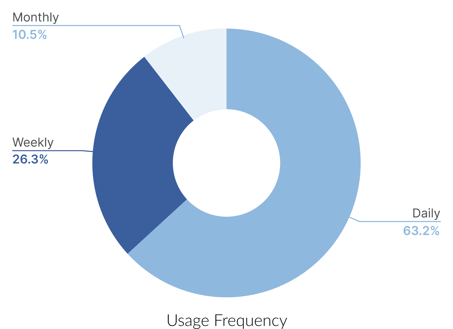
Upon analyzing these responses, we discovered that some of the most frequently used features, such as light curve observation, spectrum analysis, and scanning, are predominantly utilized on the Candidates page. We were asked to deliver our design to the front-end team as soon as possible. Given the quick turnaround required by Fritz, we decided to focus on the Candidate page first. This ensured that the most critical elements received the necessary attention first.
Heuristic
Review
02. Identify Existing UI Issues
Knowing that most key features are located on the Candidate page, our team conducted a heuristic evaluation of it to identify areas for improvement in accessibility and efficiency from a UI perspective. Some of the problems we identified include:
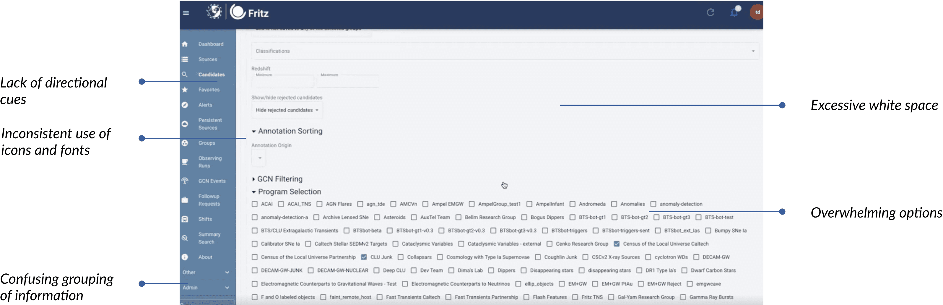
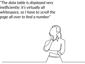
The lack of directional cues on the website can cause confusion for users finding their way around the website, leading to reduced efficiency and accessibility issues. These seemingly small UI problems can collectively lower user engagement and lead to frustration and increased cognitive load. Our goal is to create a design that effectively addresses these issues.
Identify goals
Based on our research findings, we discussed further with the stakeholders and the engineering team to solidify our visions. We identified our primary goals for the redesign:
01.
Improve information grouping by rethinking the information architecture
02.
Increase user engagement by optimizing UI controls
03.
Strategic use of white space by iterating through layouts
04.
Clear contrasts in type and color by redesigning the design system
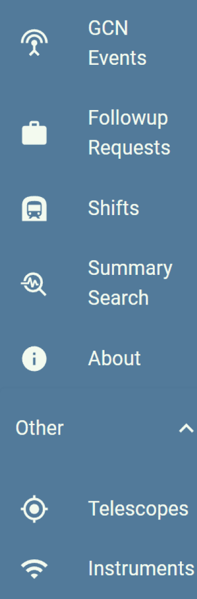

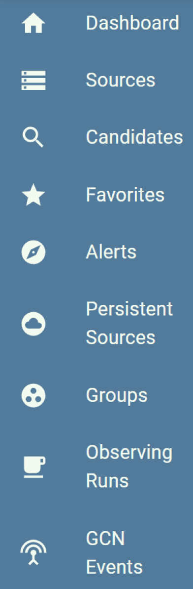
Fritz’s existing website features nearly 25 tabs on the navigation bar, with some tabs leading to pages that contain minimal content. Feedback from our user survey indicated that several of these pages are infrequently used. Consequently, I revamped the website’s information architecture, focusing primarily on consolidating related functions onto single pages. Functions highlighted in darker blue represent the areas of the website that have been revised.

UI Controls
Problem
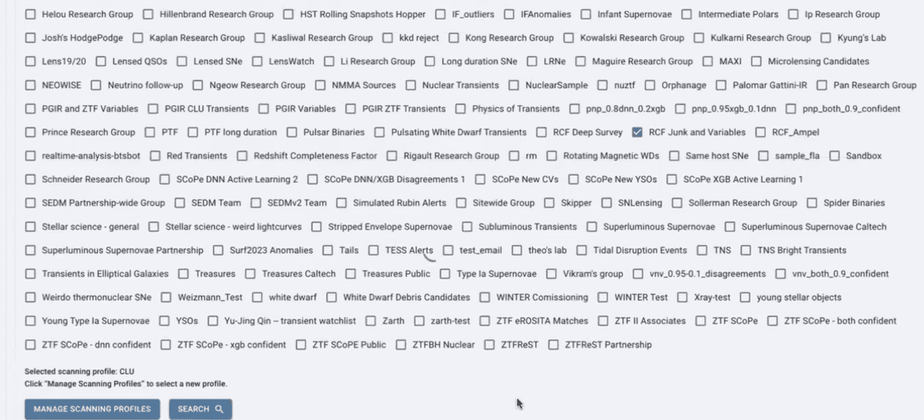
The old design presented program selections as a list of standalone checkboxes. Because there are a lot of options available, it takes up an unnecessary amount of screen space.

Layout Iteration

Version 1
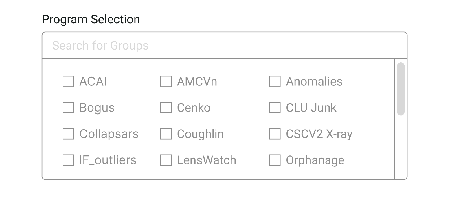
Organized selections in four groups using grid layout to reduce white space and increase readability.

Version 2
Condensed sections into the right block, allowing users to switch between tabs with the drop-down arrow.

Version 3
Reformatted the current submenus to the right block. Users can now collapse any filters they don’t need.

Version 4
Adding a horizontal menu bar on top of the Candidate page for users to switch between tabs.

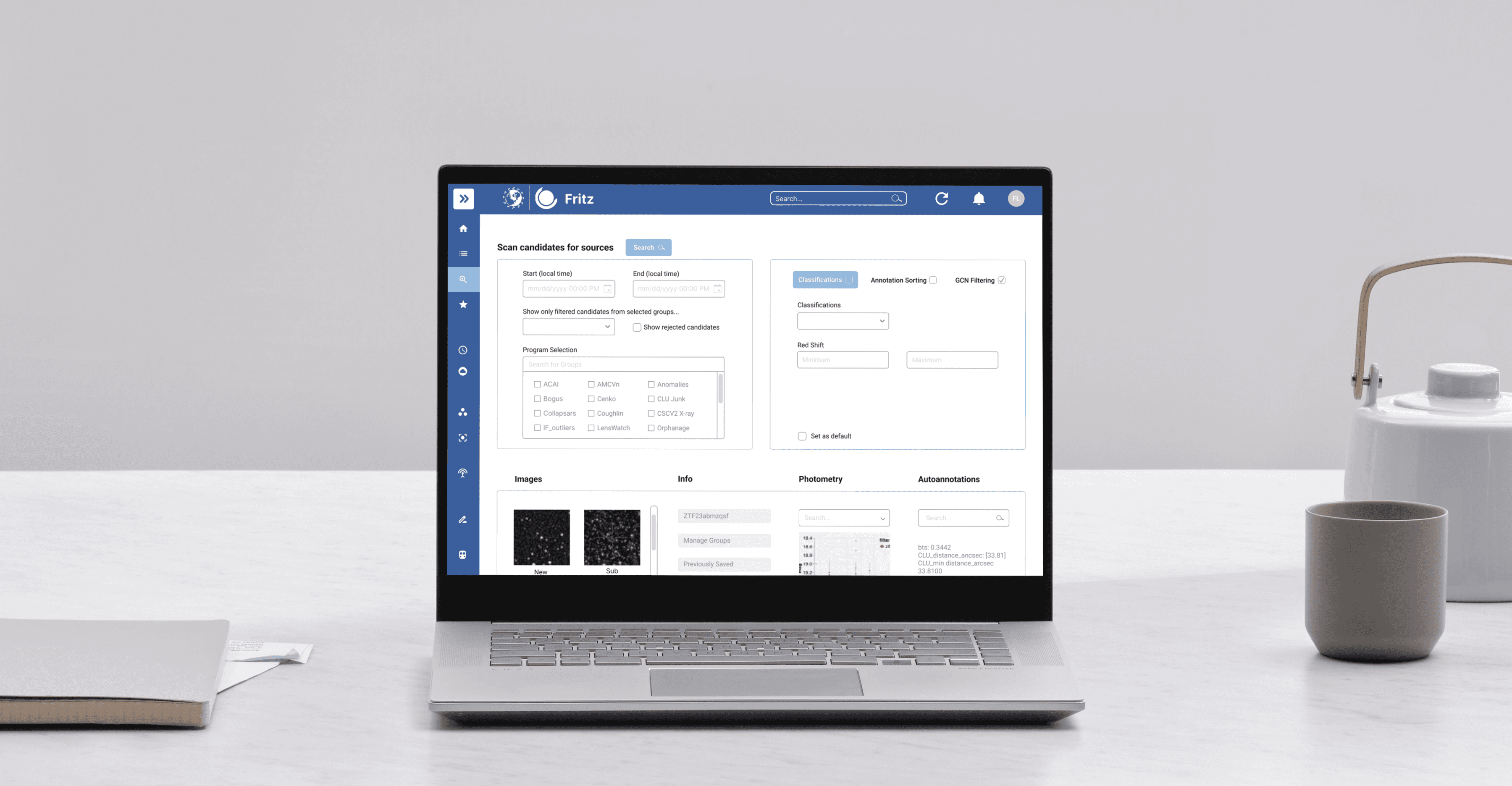
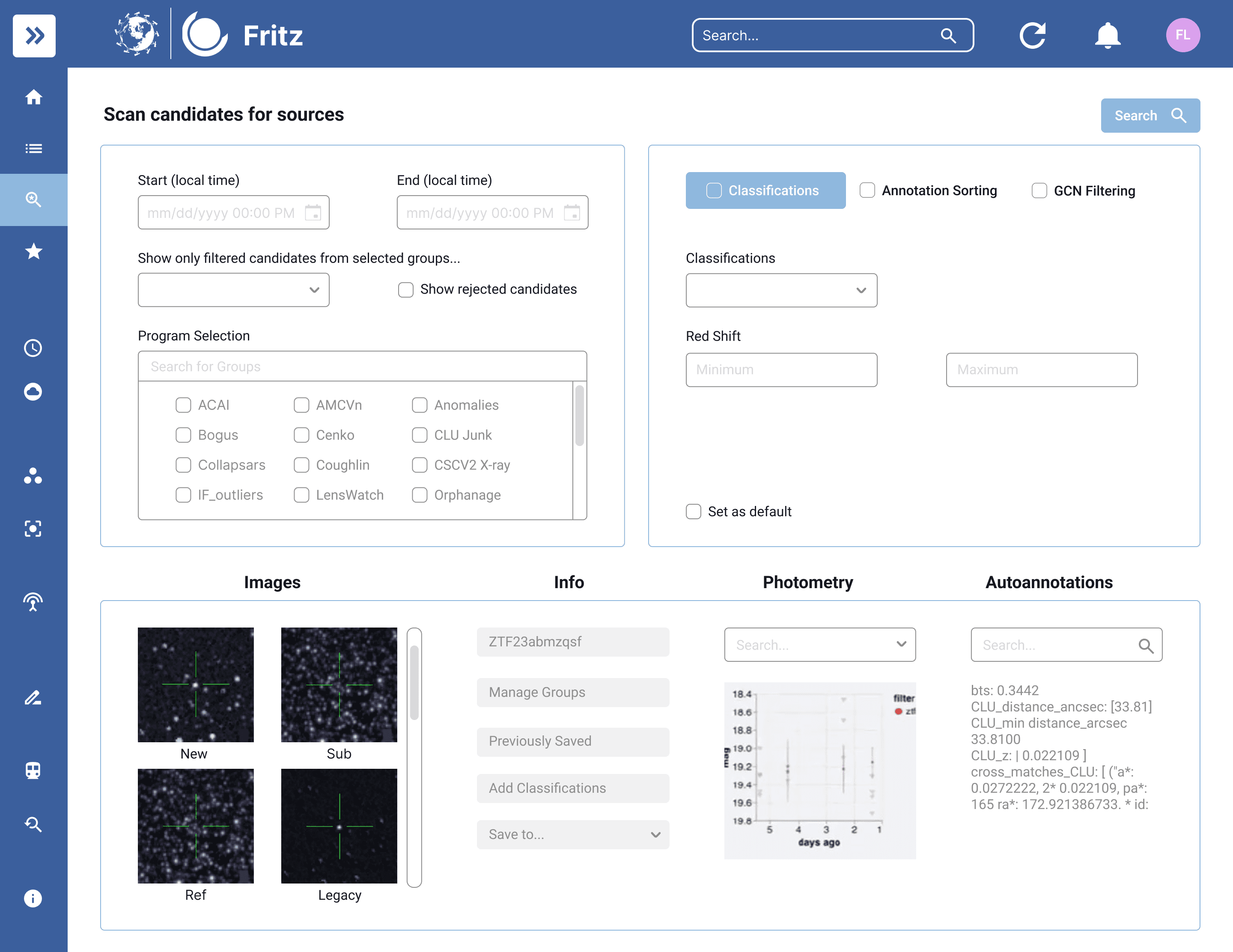
Finalized Layout
Combining the four lo-fi prototypes, we chose a layout with two main selection areas positioned side by side. The left section includes the most frequently used filters during the scanning process, while the right section is designated for less frequently used selections. These selections are categorized into three tabs based on the information architecture. This layout allows users to easily access the needed tabs while keeping the screen space compact.
Design System
Our team revamped the original color scheme by using brighter tones of blue and removing the gray background.
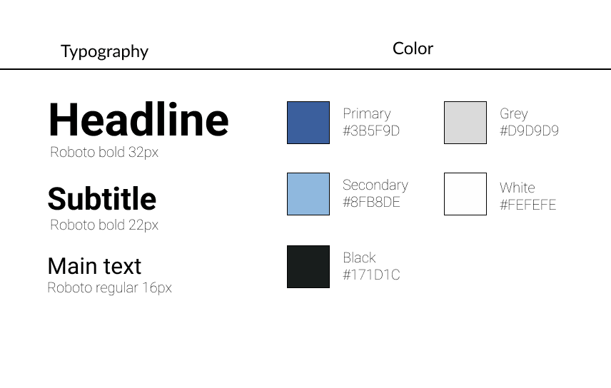
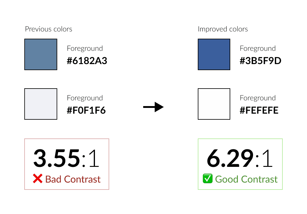
This change aims to deliver better color contrast as the color contrast ratio has significantly improved with the new color guide. The new design system provides a cleaner and more modern look for the Fritz website, making the interface feel more engaging and user-friendly.
Final Design
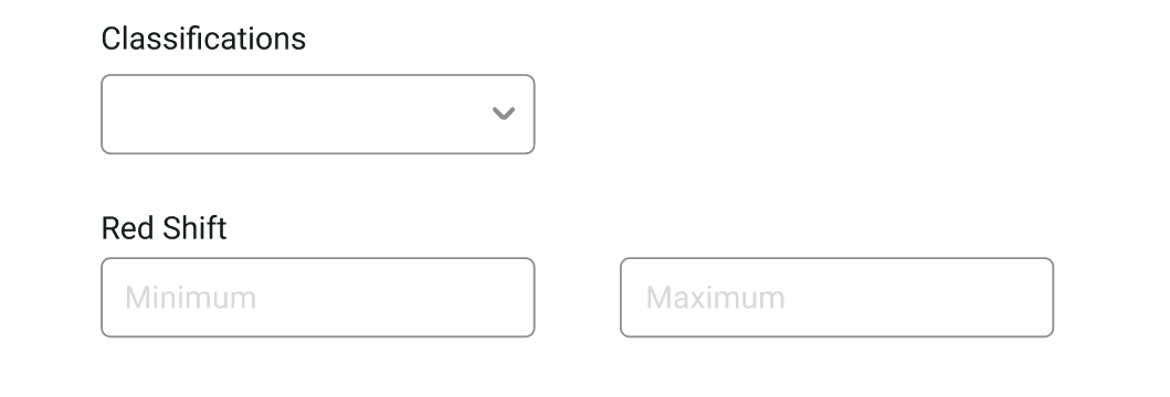
To determine which selections are less used by users, we engaged in ongoing communication with both users and the Fritz team, gathering feedback to continually refine and adjust the placement of these filters. For example, we originally included program selection in the right (shown in the finalized layout above). Based on the feedback, we moved it to the left and added a tab for classification.

Takeaways
Dealing With Ambiguity
Our client did not give our team a clear redesign requirement and expectation. This challenged helped me understand the importance of diving deep into user’s needs. From gathering insights from user survey, conducting research, and communicating with our clients, we defined our objectives and aligned everyone’s expectations step by step.
Dealing with Tight Timeline
The client’s expectation for a quick turnaround altered my usual approach to UI/UX redesign projects. To address this, we prioritized the critical pages and features that needed the most attention based on user needs. We also ensured a smooth transition from Figma designs to frontend development.